
DH Press is already mobile optimized. Though our design team did not intentionally focus on making the first beta release of DH Press fully mobile-ready, it plays nicely with smartphones.
All along, we’ve been designing the tool with an eye towards functionality on iPads/minis, as well as other tablet devices. As such, we’ve been mindful to keep load time to a minimum regardless of the amount of data present in a project. We made sure that our interactive filtering legends were easy to use on tablets; rather than appearing next to the map they show up underneath. Other than that, we didn’t give mobile much more thought.
But as it turns out, DH Press is ready to be used by smartphones right now. We chose as our default theme a mobile-optimized theme: Twenty Twelve. So as long as you don’t change the default theme (or pick one that is also mobile optimized), your DH Press project will render on smartphones and tablets.
Features
DH Press on Twenty Twelve features an expandable menu for easy navigation.
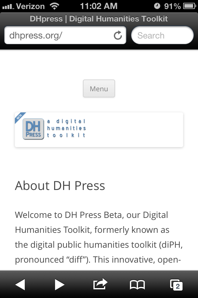
DH Press homepage with collapsed navigation menu.
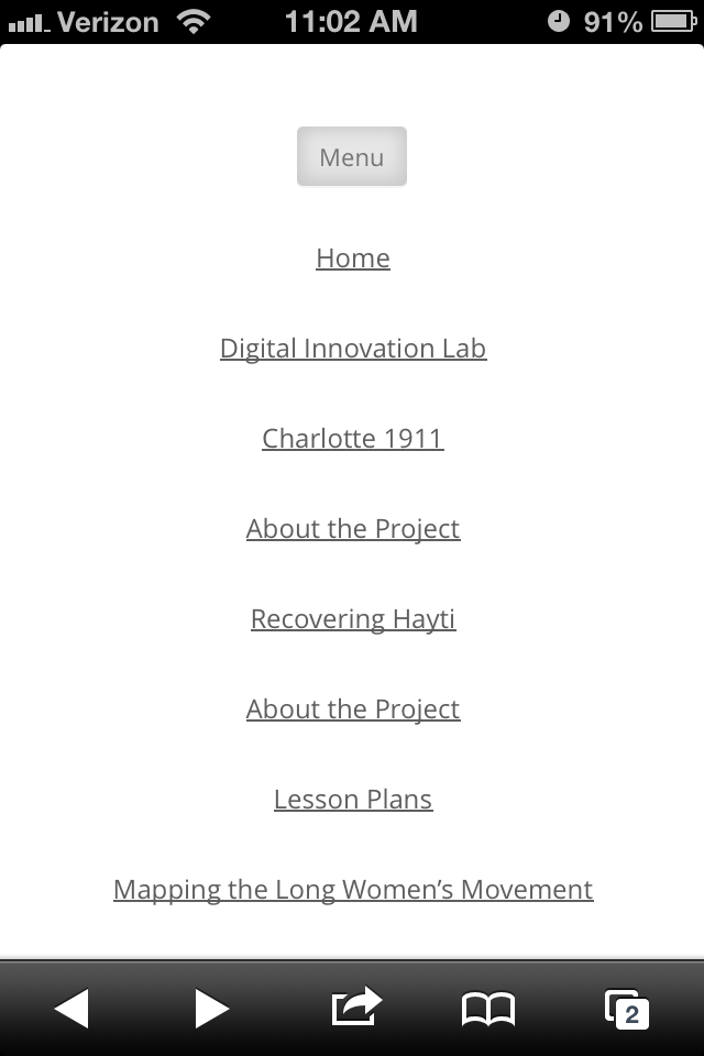
DH Press homepage with expanded navigation menu.
Additionally, we’ve customized the CSS to automatically resize the map so you won’t have to. No matter what width and height you set the initial map view for standard monitor sizes, DH Press should automatically adjust the map for mobile users!
Test
I tested the Charlotte 1911 demo project on my iPhone 4s on a wifi network. This project currently has 1,000 data points, and I was pleased to see that load time was quite reasonable. Even on a 3G network, it took less than one minute to load 1,000 points.
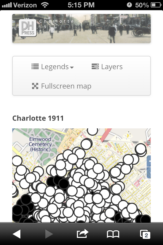
Charlotte 1911 DH Press demo project with project header and interactive legends.
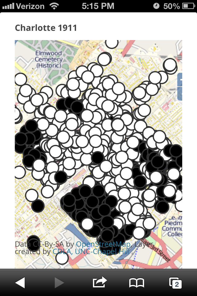
Charlotte 1911 DH Press demo project interactive map.
The mobile version of the project contains all of the affordances of DH Press: I can pan and zoom to explore the map, click on individual markers, see the lightboxes (“modals“) that pop up when a marker is clicked, and follow links out to individual marker pages!
Of course, projects containing large media files may still experience load time problems. Once our “Mapping the Long Women’s Movement” project comes online, we’ll see how well DH Press Beta Mobile handles large audio files. Stay tuned…