Rebranding diPH

In my last project update, I mentioned that we were rethinking the name “diPH” on the eve of the beta 1.0 release of our digital humanities toolkit. After some helpful feedback and many internal discussions about what the name of the toolkit ought to invoke, we’ve come up with “DH Press.” This plays off of the WordPress brand, similar to other tools out there like BuddyPress and CommentPress. On top of that, we hope that DH Press is suggestive of the ease with which you can create digital projects using our toolkit – just a “press” of the button and you’re on your way to publishing an online digital humanities project! Jade is working on some different logo concepts that will help us visualize and communicate the tool’s purpose and ease of use.

We’ll continue developing this concept as we gear up for our big launch. Look for that announcement … coming very soon.

diPH Pre-Launch Feedback Requested

As the date for the Beta 1.0 release of our digital public humanities toolkit, diPH (pronounced “diff”), approaches, we’ve begun thinking about whether this might be the ideal time to start thinking about branding, or to be more specific, re-branding. We’ve never been 100% thrilled with the name, as diPH can be confusing to pronounce. More importantly, we don’t think it communicates effectively the toolkit’s full potential, both now and what it might evolve into in the coming years.

Now that we’re seriously rethinking how we want to present and package the tool, we could use your feedback. Not only are we interested in a catchier name, we’re also deeply interested in how our potential users think about and imagine the tool. Of course, we’re planning to do more formal user testing in the coming months, but this survey (also embedded below) will help us get a sense of how we’re doing.

So let us know what you think! All ideas are welcome, whether you have an idea for a new name or a future feature or function (check out this overview if you’re not sure what diPH Beta 1.0 will be able to do).

As always, contact me if you have any questions or thoughts, and thanks for your help!

Looking Ahead

It’s the start of a new semester here at UNC, and we’re gearing up for many exciting diPH-related developments in the coming months.

diPH Beta 1.0

We’re looking forward to releasing diPH beta, hopefully in early February. You’ll be able to get the plugin on GitHub, and we’ll also make a zip file available at diph.org. We’ll begin drafting documentation, training videos, and demos soon.

Mapping the Long Women’s Movement

We’ll be launching our first pilot project, Mapping the Long Women’s Movement, by the end of January. Look for a big announcement about that!

Security Audit

Joe Ryan, Humanities Research Associate at ITS Research Computing and diPH team member, will be leading our efforts to complete a security audit on the beta 1.0 plugin with UNC’s ITS and OASIS. If we pass muster, we’ll be able to incorporate the plugin into web.unc.edu websites, which will provide UNC users with additional support. We’d love to accomplish this by the end of the semester, so that Carolina users can begin incorporating these into their WordPress sites this summer. We’ll keep you posted on that front.

Beta Projects

We’ll be undertaking four new beta projects this semester in Bobby Allen’s graduate seminar, AMST 840: Digital Humanities/Digital American Studies. This course was designed as a laboratory for testing diPH beta. Our graduate students — who come from a range of departments including Geography, Religious Studies, Education, History, and SILS — will work with clients to launch diPH projects by May 6. They’ll be creating a Digital Wilmington Race Riot Project with the NC Civic Education Consortium; continuing our work to map Lebanese Migration to North Carolina, 1900-1920 with NCSU’s “Lebanese in North Carolina” project; designing diPH sites for two UNC professors to use this summer in their field-based learning courses; and helping a team of researchers in Munich, Germany map the global spread of purpose-built theatres from 1850-1990. I’ll be blogging in more detail about each of these projects in the coming weeks.

Onward!

And, of course, we’ll continue to test, refine, and extend diPH. If you’ve got an idea for a neat feature for diPH, email me!

Meet the Newest Member of the diPH Team

The Digital Innovation Lab welcomes the newest member of our team: Jade Davis. Jade is a PhD student in the department of Communication Studies, with a Media Studies and Performance focus. Her research interests explore how diasporic people use digital technology, asking the question, “what does it mean to be Black online?” Jade was a HASTAC Scholar and Student Representative to the Steering Committee, has been involved in the Mozilla Labs Design Jam, and helped organize last fall’s THATCamp RTP. She comes from a web design and production background.

Jade will join the diPH technical team, assisting us with documentation and training materials for diPH Beta 1.0. She will also work on theme design this spring.


diPH Beta is Nearly Ready

We have been hard at work getting diPH beta 1.0 ready for release in early 2013. Our tech team has been finishing up the administrative backend to ensure that project creation is as intuitive as possible. Meanwhile, our pilot project, Mapping the Long Women’s Movement, is close to completion. We’ve prepared nearly all of the data, and are beginning to play with it in our development space to improve the visualizations and interactions.

Beta 1.0

In advance of the first beta release, here’s an overview of where we expect the beta version of the plugin will be by the end of January.

–Project Layer

As I’ve discussed in a previous blog post, any material you upload into diPH will be organized and bundled into projects. Essentially, admin users will set up new projects, where they’ll define their project settings: the type of visualizations (primary and secondary), the custom fields they’ll use, the taxonomy for structuring those fields, and the categories which will drive the visualizations. Associating new content with a particular project—whether via bulk data ingest from a csv file or manually adding a single data point—will apply the project settings to the data, resulting in the proper structure and display of the data. Finally, you’ll be able to create and customize a project-level visualization legend—what fields will users be able to search and filter on?

Map Layer

The map layer should be ready by the end of January. This feature allows you to select a base map(s) for your spatial visualization (e.g. Google Satellite imagery, or Bing maps). From there, you can layer other maps over the base map. We’ll have a map library containing some historic maps (made available through the Carolina Digital Library and Archives Map API). Eventually, you’ll be able to add new maps to the Map Library: if the map was processed in a format compatible with OpenLayers, all you’ll need is the map’s URL to render it as a map layer in diPH. Map layers will be interactive, allowing end users to turn maps on/off and change the level of transparency.

Data Points

As I’ve noted in an earlier post, the visualization(s) an admin selects for a project will dictate how the data point will display on the front end. A map visualization, for instance, will result in a marker (or a polygon, a feature that will likely not be included in Beta 1.0 but should be available by the end of the Spring 2013 academic semester). A timeline visualization would produce events. The visualization can be rendered on the fly depending on what a site visitor chooses as the active visualization. We’ve also been developing an Icon Library to support icon customization. And we’re currently working on ways to display large numbers of data points at different zoom levels via on-the-fly customization. We’re not sure if that feature will be ready by the end of January.

Because diPH is built over WordPress, each data point will be a stand-alone post. Once you associate the point (currently called a “marker”) with a project, all of the pre-defined fields you’ve already established will show up on your “Add New Post” page. You’ll have the option to add new fields for any given data point, though you’ll want to be careful that your data is as standardized across the project as possible. Of course, you’ll be able to include the usual post content—free text, images, videos, and other multimedia.

Data Management/Interoperability

We’ll be creating documentation and training materials for managing bulk data in diPH—how to format data, import it, delete it, and bulk update it. For now, we strongly recommend users create their data outside of diPH and then import it in. We intend to provide a few csv templates for diPH users, but this won’t be ready for beta 1.0. Data will be exportable out of diPH via JSON feeds, as well as the normal WordPress export functions.

Another thing that won’t quite be ready, but that we’re keen to build into the tool, is a data formatting tool. To make your data as interoperable as possible, diPH will eventually be able to transform your data into an open standard, such as GeoNames and Well-known Text (WKT). Rather than require admin users to know how to format their data, diPH will be able to read and convert data. This should apply to locations and dates for starters.

Other Visualizations

At the time of the initial beta release, we expect to have at least two types of visualizations: maps and timelines. We probably won’t be able to offer anything but marker point visualizations, but eventually we will incorporate polygon and line data on the map. Using the open source TimeLine JS program, we’ve begun playing around with timeline displays. Eventually, we hope to combine the two visualizations so that we can render space and time together.

We are also currently testing the capability of rendering more than one interactive map in a single project interface. This will facilitate side-by-side comparison of different locations. We hope to be able to support up to four unique maps in a single interface, assuming load time isn’t too adversely impacted.

Audio/Transcript Tool

See this previous post about our A/T tool to learn more about our work on this piece of diPH, which will be part of the 1.0 beta release. Transcript editing and data point creation will not be part of the initial plugin release.

End User Interface

In addition to user interactions with the visualizations, as well as search and browse capability, diPH beta should feature a help mode and hover display of additional information. For admin users who activate these features, they will be able to provide in-line instructions and explanations to their site visitors.

User-Generated Content

While WordPress allows unregistered users to post comments, diPH beta 1.0 will not allow any other user-generated content. We plan to let users tag and create their own data in a future release, but we will need to think through user account management (possibly relying on existing social media account management, thereby allowing people to log onto a project via Facebook or Twitter).

Administrative Interface

diPH beta will feature what we hope will be an intuitive administrative back end/dashboard for easy project and data creation.

Site Structure and Organization

Since WordPress allows a high amount of customization with respect to website structure, we expect diPH will allow that as well. We’re hoping to include some sort of breadcrumbs and wayfinding, including a way to either undo or reset visualizations. Another possible implementation would be to show to the site visitor his/her selection/click history.

OS Capability

diPH is currently compatible with iPads but not smartphones. We’d like to address this next semester if possible. We’ll also start testing diPH in different operating systems. While Internet Explorer is a particularly problematic browser for loading large amounts of data, we need to make sure diPH will work in IE, as we expect a great many of our public users rely on this browser.

Install and User Documentation

Finally, as we finalize diPH beta’s look and feel, we’ll begin creating modular training documentation and videos (expect this material to start coming online in February). This will help admin users create projects, format data, and customize the look of their projects. We’re also hoping to support multi-site instances, so that every time we update the diPH beta code, it will cascade down to all diPH sites (whether we’ll be able to deliver this by 1.0 release is still uncertain).

We don’t expect to release the plugin to the WordPress plugin directory until we’ve gone through several more development cycles. For now, we’ll make the code available on GitHub, and we’ll include a zip file along with install instructions on diph.org. Depending on demand, the DIL may be able to provide some support for individual installations.

A New Year

Look for our first beta pilot project to come online sometime in January. And, we’ll begin four new beta projects early next year as part of Robert Allen’s AMST 840 graduate seminar. Stay tuned!

diPH Audio/Transcript Demo

We’re hard at work to finish diPH beta by the end of December, and along with that, our pilot project — Visualizing the Long Women’s Movement. The project has provided many opportunities to refine our thinking about how the plugin will work, and how data might be structured within a typical diPH project (more on that to come in a future update).

The oral history pilot project has led us in some interesting and unexpected directions. Most notably, it has pushed us to think about how to connect audio and text to a visualization. We wanted to annotate (“tag”) oral history transcripts to create multiple points of entry and exploration into an oral history. But we also wanted users to interact with the actual audio (whereas in a more traditional setting, the primary interaction is typically with the text transcript; often researchers never hear the original audio). We were also concerned about splicing the audio into stand-alone pieces because we didn’t want audio clips taken out of context.

These requirements led us to a solution that allows us to preserve the entire audio file while creating meaningful points of entry into a set of interviews – by linking the audio file to the text transcript.

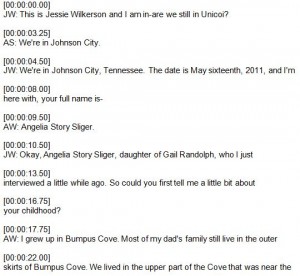
The first few minutes of an interview transcript with timestamps added.

We ran each of the edited transcripts through Docsoft:AV, a Dragon-based audio mining software tool. DocSoftAV creates a time-stamped text file of the transcript, with regular intervals at every few seconds (depending on the rhythm of the speaker). This process transforms conventional transcripts into segmented transcripts, which will allow diPH users to jump around in the audio and the transcript simultaneously.

We applied the timestamps (start and end times) to pre-selected content that the SOHP had already tagged. Once the front-end visualizations are completed, users will be able to click on data points (markers on a map, for instance) and listen to and read along with a segment of the total interview. Though a specific data point will have a specific segment of the interview associated with it, users will be able to move beyond that segment at any time. They can go back to the beginning, jump forward, or repeat sections. And, of course, users may listen to the entire audio file – with accompanying text rolling by similar to a karaoke machine – from start to finish, as this crude demo shows:

[vimeo]http://vimeo.com/54795851[/vimeo]

We will create visual cues inside the transcript to indicate whether a particular section of the text has already been tagged (perhaps with an icon or different color text). Eventually, users will be able to highlight a word or set of words in order to annotate/tag the interview themselves. That is, users will be able to create their own data points within the project. We are also exploring the possibility of enabling users to edit the transcript via a wiki-styled edit tool.

Ultimately, the audio/transcript piece of diPH will be integrated fully into projects, so that they are not separate from other entry points. In short, they will be embedded with other visualizations, so that users will be able to see, hear, and read the project’s content.


Look for more information about this project (coming soon), and stay tuned to our project blog to find out when you can start playing with diPH!

The diPH Project Layer

We’ve devoted a lot of time in the past few weeks to working out how the project layer – the highest level within diPH – should be structured. The goal of this layer is to package all of a project’s associated content (visualizations, data, and user-generated content) into a unified bundle as a single JSON feed that can be exported to other diPH installations, CMSs, or blogs. All diPH content must be associated with at least one project, though content can be re-used across projects, whether in a single diPH instance or not.

A high-level view of the project layer, and all of its associated content.

While all of the data will have the same backend structure, it will be rendered differently on the front end depending on the visualization chosen. A geo-spatial project, for instance, will use a map as its primary method for displaying its data. The map, then, would be the main (but not the only) point of entry into the project’s content. As we work on our oral history pilot project, we have been exploring other visualization types, including using individuals and concepts as additional points of entry. We envision a display of “people cards,” where site visitors can browse via each oral history interviewee. Likewise, concept cards (possibly ranked based on number of mentions) will be another point of entry. Allowing multiple visualizations enables us to support both structured search and exploratory browse for our users. Additionally, we are experimenting with how we can continue to preserve the other visualizations regardless of the active visualization. For instance, when a user wants to browse by concept cards, we’d like him/her to also see the interactive map, at least as a thumbnail. This will help users draw connections across the visualization entry points, hopefully producing a more cohesive project. (More on our progress on the Long Women’s Movement pilot to come in a future update.)

Though a project may have multiple visualizations for its data, only the primary visualization will determine the type of data point (a marker, date, tree element, network node, etc.). Once a primary visualization is selected, secondary and tertiary visualization types may be applied, and can be edited at any time by the admin user.

All of the content in a project is contained in WordPress posts. That is, individual markers, events and so forth are stored and rendered as blog-like post pages. This allows us to maximize WordPress’s blog power. But we are adding some important enhancements that enable us to harness the potential of WP’s underlying MySQL database. When setting up a project, an admin may create an unlimited number of “custom fields” (think of these as attributes in a database), which will be associated with every data point (or WP post). This allows the project’s information to be structured, which allows for rich search. Additionally, faceted search will be possible because admins will be able to create structure within and among their custom fields by creating filter controls (more on this in a future post). That is, custom fields can be arranged into hierarchies and groupings to support controlled vocabularies and other taxonomical organization.

Admins can select a custom field to serve as the primary category for a project. The category determines the appearance of the data point. For instance, in the Hayti demonstration project, buildings with a commercial use display as red, residential properties are yellow, and community spaces (such as churches or schools) are blue. This allows site visitors to quickly see and process the different data points. Because the category has the same structure as any other custom field, admins can change their categories as they create the project, and they can also create structure (child categories) to enrich the visualization. In a geo-spatial project, the categories determine the marker icon (color, shape, size), but the same applies to other visualization types.

Of course, an admin may choose to leave the data unstructured, and can add the content in narrative form to the data point’s post content area (that is, he/she can simply load text as if publishing a blog post). This makes it easier to create a project, though search capabilities might be more limited. While full-text search is always possible in WordPress, the kind of faceted search we’ll allow won’t be possible without custom fields. We recommend that projects contain at least one custom field, which can be used as the category to drive the visualization. A project with few, if any, custom fields will emphasize browsing over specific search tasks.

Finally, projects will contain user-generated content, including tags and comments. WordPress currently supports tags, which we used in the Hayti project (each tag is a specific building use, such as barber shop or funeral home). Tags are non-hierarchical metadata (i.e. additional descriptive data). For now, we will reserve tags for user-generated content. Site visitors would be able to tag (and save) data in a project in ways that are meaningful to them (a folksonomic approach). WP also supports comments, and since every data point is a post, it is very easy for users to comment on data. We are not focusing our current efforts on user-generated content, but once the beta version is completed we will begin working on this aspect in the next phase of development.

Why WordPress?

(and not another CMS)


Whenever I talk about diPH, regardless of someone’s technical knowledge and experience, the question of why we opted to build the toolkit in WordPress inevitably comes up. There are several compelling reasons for relying on an existing open-source content management system (CMS), as compared to custom building a platform from scratch. Modifying and building on top of a stable, open-source platform allows us to be more cost effective in creating our own tools while maximizing our in-house programming capabilities; we don’t have to worry as much about underlying sustainability; we can tap into a community of developers, borrowing what they’ve done and allowing them to play with what we’re doing. The result is a robust and stable product.

Many DHers understand and are themselves pursuing the OS route. So what I want to focus on is why we chose WP, as compared to other platforms, such as Omeka or Drupal.

1. It’s stable and robust.

There are a lot of CMSs out there, but not all are as mature as WP, and many don’t have nearly the number of extensions (plugins, modules, add-ons) compared to WP’s 21,774 and counting. Omeka, for instance, is an excellent CMS that GMU’s Roy Rosenzweig Center for History and New Media built for digital exhibitions. Initially released in 2008 (WP began in 2003), Omeka is a great tool for folks with little technical know-how, though customization is limited if you don’t know code. It features add-ons, including themes to style the look and feel of your site, and plugins that allow you to map content, connect to other Web 2.0 services, and customize metadata through Dublin Core extensions, to name a few. The CDLA is currently piloting Omeka as a platform for faculty-driven digital projects.

2. It’s widely supported.

Not only is WordPress widely supported (somewhere between 17 and 22% of all websites worldwide are built on or supported by WP), but there is a large developer community for us to connect with. Equally, if not more importantly, WP is widely used and supported across the UNC-Chapel Hill campus. More and more of our department and school websites are running on WP. While we expect diPH to be adopted broadly beyond the campus, having a strong WP presence at UNC means debugging, testing, and enhancing the plugin will be that much easier for us.

Furthermore, we are working with OASIS to try to integrate the plugin within the web.unc.edu environment. This is the mechanism for UNC-affiliated people and groups to create their own WP-based websites. Being able to use the plugin in this environment provides additional support and sustainability for UNC adopters of diPH.

3. It’s easy to use.

Perhaps more importantly, WP is easy to use, with friendly interfaces and helpful documentation. We had strongly considered using Drupal, a more sophisticated CMS that allows far more powerful customization and data modeling. But the learning curve for Drupal is steep and it is not as out-of-the-box usable compared to WP. The goal for diPH is to lower the technical barriers of entry for folks who want to create digital humanities projects. Drupal has more bells and whistles than WP, but humanists would probably not be able to use it independently without significant training.


We recognize that WP is not the solution for everything, and that it won’t be able to support every DH project. We may even hit a point where diPH outgrows WP. But to achieve the greatest good for the greatest number of people right now, WP was a no-brainer for us.

A Look at diPH’s Architecture

Now that we’ve completed a fully-elaborated demonstration project in our diPH prototype, and have begun to work on the actual diPH plugin, we’re thinking in earnest about how all of the beta features will fit together, on both the back and front ends.

Map and Marker Icon Libraries

A high-level view of the diPH plugin architecture, designed by Joe Hope using the Idea Sketch app.

Two of the critical features we plan to offer are map and marker customizability (for projects with a geo-spatial component). Our work on Main Street, Carolina taught us the need for an extensible set of maps and marker icons. While we will provide a map library of current maps that can be used in diPH, we do not want to limit our tool to one set of maps. To be extensible, we need to be able to pull in map layers from a range of servers using a range of georeferencing and rendering protocols, including Tile Map Services (TMS) and Web Map Services (WMS). Our hope is that, through the use of APIs in the map library, all a user need do to add a new map is copy and paste the URL of that map’s source location. That is, rather than serve all the maps through diPH, the tool will point to other maps in other locations – but the site visitor will not notice the difference. New maps should retain their functionality in diPH.

Additionally, it’s important that the ways of marking up the map will be highly customizable – from the standard pin drops that you see in Google Maps, to recognizable icons for institutions such as banks, hospitals, schools, and so forth. Administrative users will also be able to create and add their own icons, thus making our marker icon library extensible. And, we’re also exploring how we could generate and display polygons and line data on maps.

Marker Capabilities

Much of our work has been devoted to thinking through the user experience for creating, editing, and deleting markers (or, for non-geospatial projects, data points). Broadly speaking, each data point functions as a “post” in WordPress. So whether it’s a marker on the map, an element in a genealogical family tree, a point on a timeline, or a node in a network visualization, each data point will share the same functionality (for simplicity, I’ll refer to data points as markers). Like any WordPress post, markers can have titles and textual information (e.g. interpretative analysis or narrative) and can support a range of multi-media content. They can be assigned categories (hierarchical) and tags (non-hierarchical descriptive labeling).

But that’s just the beginning. Users will be able to create and define custom fields for markers. These would be the equivalent of attributes in a database (i.e. columns in a table). Admin users will be able to modify, add, and delete their fields at any point in the creation of their project. And they can decide how their site visitors will interact with those fields. That is, some fields might contain additional filterability and searchability. When logged in, administrative users will be able to edit the content of their markers from the administrative dashboard as well as from the front end. We envision a seamless set of interactions for administrative users that reduces the number of unnecessary clicks in a streamlined interface.

Look for a much more detailed blog post on marker capabilities in the coming months.

Audio/Transcript Tool

One added piece we’ve started developing is the Audio/Transcript tool, inspired by our Long Women’s Movement Oral History pilot project. This will allow us to stream audio and text simultaneously. We’re beginning to think about how to extend this functionality to other media types, such as video or images. More on that in a future post.

Project Layer

And then there’s the project layer. All of the data for a project (for instance, each of the properties in the Hayti project, along with each parcel’s corresponding details and documentation) will be tied together in the project layer. Think of it as the top-level category or root node in a hierarchy. Anything that you add will be bundled together under that project category (all markers, images, media files and any descriptive or interpretive content you’ve created). This will allow users to export projects out of diPH via project feeds. Project feeds can be pulled into other websites, loaded into other diPH instances, or transformed for use in another platform. This approach also allows us to create multiple unique projects within a single diPH interface. Creating, for example, three separate and unrelated projects can either be done by hosting three unique diPH websites, or including them all in a single website. The project category layer allows you to silo your projects, as we have done in our diPH prototype – the data for our Charlotte 1911 project is completely separate from Hayti. The two projects require different categories, different tags, and different content types, but because they are distinct projects in diPH, there’s no conflict between their different structures.

Administrative Layer

Encompassing all of these layers together is our Admin layer, which we’re designing to fit seamlessly with the WordPress Dashboard. We want to make it as easy as possible for administrative users to create and edit their content, while taking advantage of all of the affordances WordPress has to offer.

This is just a taste of what’s to come. Stay tuned for more detailed looks at these different pieces of our plugin.

Meet the DiPH Development Team

Our diPH development team spans several different UNC units and crosses many disciplinary boundaries.

Our primary developer team consists of three amazing programmers:

Joe Hope is our lead developer. Officially, he’s a RENCI web developer focusing on WordPress theme design and plugin development, but we like to think of him as our WordPress guru. His previous work on the Soundings Project provided relevant experience with the sort of DH projects and user experiences we’re looking to deliver with diPH. Among his many responsibilities, Joe is tasked with translating our overall vision for the diPH toolkit into achievable technical steps, milestones, and deliverables. Joe has been working on coding the top-level project functionality of the plugin, which incorporates all features an admin user might want to associate with an individual project, including type of visualization, as well as all of the associated content, including maps, markers, data, and so forth (more on the diPH structure coming in a future blog post!).

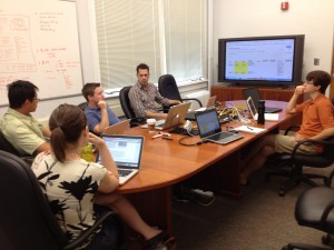
The diPH development team talks to SOHP’s Seth Kotch about the Long Women’s Movement diPH project.

Bryan Gaston is a second-year MS student in Information Science at UNC’s School of Information and Library Science (SILS) and, among other things, a database guy. He spent this summer working on enhancing diPH’s search capabilities through faceted (or filtered) search. He is now focusing on WP interface issues, so that the administrative interface for diPH blends seamlessly with that of WordPress. He’s also tackling the marker level of diPH — all of the options for creating, populating, and porting custom fields into diPH.

Chien-Yi Hou, a Research Associate and PhD student at SILS, brings his vast experience in web development and text mining to the project. Given his work with creating KML maps for T-RACES, he’s working on the diPH’s map library. This critical component will allow users to pull in and create map layers for their projects. Our goal is to be able to pull in georeferenced maps from a broad range of sources — the Carolina Digital Library and Archives (CDLA) map collection, tile mapping services, and web mapping services. Ultimately, users should be able to paste in a URL for a map and not have to worry about map configuration. We’re also exploring the use of map APIs to help us reach our goal.

Our core development team is augmented by several other important voices. Stephanie Barnwell, a SILS master’s student pursuing a joint master’s in public history at NCSU, will be managing the projects we’re lining up for the spring to test diPH beta. She’s been sitting in our meetings to learn as much as she can about how diPH will work, so that she can help scope test projects. Joe Ryan, Humanities Research Associate for ITS Research Computing, has started joining our development conversations. He works with humanities faculty on campus to connect them with technology, and he will be contributing heavily to the Carolina Digital Humanities Initiative. And, members of the OASIS web development team join us as often as they can. Their expertise with the uses of WP on our campus provides a critical perspective on how we can make diPH compatible and compliant with broader UNC web policies.

Seth Kotch, Digital Coordinator at the Southern Oral History Program, is the client for our Long Women’s Movement pilot project. We are developing this project as a way to drive diPH beta development. Look for a future blog post about this project soon.

And, last but not least, there’s me – the project manager for diPH. It’s my job to keep everyone on the same page and on track to finish by December 31. I’m also working with Stephanie to line up testable projects for the spring, so if you have an idea, email me!