
With the overhaul of DH Press for its 2.0 release this past summer, subsequent development of our digital humanities visualization toolkit has been speeding up. Later this fall, we’ll release version 2.5. In the meantime, here’s an overview of the new visualizations DH Press 2.5 will support.
In addition to maps and the topic card views that we introduced with v. 2.0, we are in the process of adding 4 new visualizations and some extensions of current functionality.
Pinboard

Test Pinboard using cover art for the Beatles’ Sgt. Pepper’s Lonely Hearts Club Band
Users will be able to load an image as a background image, and then “pin” content (markers) to the board. This will function similar to the map, which uses latitude/longitude pairs to pin markers to a base map. In this case, markers will be associated with points on the image using X,Y coordinates (which can be determined from MS Paint, Mac Preview, or other tools that enable image editing).
In addition, DH Press 2.5 will support the addition of SVG layers on top of the Pinboard (similar to our map overlays). This can be used to annotate images, create additional visual cues, and give project admins more powerful customization of the visualization.
We are also working to incorporate animation of the SVG layers in the Pinboard view. Associating SVG layers with points in an audio or video file will allow various SVG elements to turn on/off in synchronization with audio. This would allow project admins to provide a more guided tour of the visualization.
Timeline

Sample timeline view
Many users have been asking for a timeline view for a while now. We are currently testing such an implementation. For this version of DH Press, the timeline will be a standalone visualization, but we hope to someday integrate it with the maps so that we can visualize space and time together. Details about how to configure temporal data will be available along with the 2.5 release.
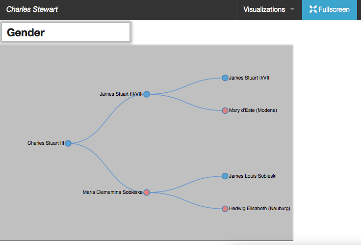
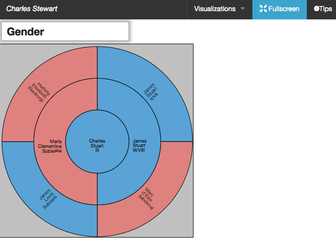
Basic Networking Visualization
Given the DIL’s work mapping people in the past, we have begun to develop basic visualizations for creating network graphs. For now, we can do a basic flat tree map, similar to a genealogical family tree, as well as a segmented wheel. We are also working on a third visualization for large data sets.
-

- Flat Tree
-

- Segmented Wheel
Facet Flow
This visualization allows you to show connections between different facets — or attributes — of your data. In all of our other visualizations, we can only display one aspect of the data (this is the active legend). Facet flows allow you to show two or more dimensions of your data at the same time, by visualizing dynamic connectors between facets. This illustration shows two dimensions of data — type of object, and materials used to create the object. Users can invert the dimensions, and mousing over displays a count of objects, which corresponds to the thickness of the connector. A list of relevant data points are displayed below the visualization when a thread is selected. Clicking on a data point will pull up the global modal lightbox with additional information. This visualization will be particularly helpful for projects with very large data sets.

Audio/Transcript Widget Enhancement

Embedded YouTube video using our audio/transcript tool.
Finally, we are working to enhance the audio/transcript widget, which allows us to sync SoundCloud audio files with textual transcripts. We expect that the new release of DH Press will support YouTube video files, synced to textual transcripts.
Look for these and other exciting enhancements in DH Press 2.5,
which should be released by the end of 2014.